Four Cities, One Voice
At Dotgraf, we believe design has the power to make ideas travel – to cross bridges, speak new languages, and light up the stories behind places and people. That’s exactly what we set out to do with APTRAD, the Portuguese Association of Translators and Interpreters.
What began in Porto quickly grew into a national journey. Four cities. Four conferences. One evolving visual identity. From the granite soul of Porto to the vibrant waters of Aveiro, we created a unified design system that highlights what makes each place – and each event – unique.
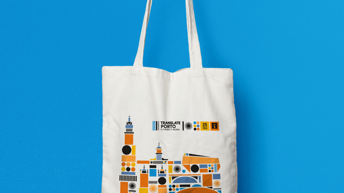
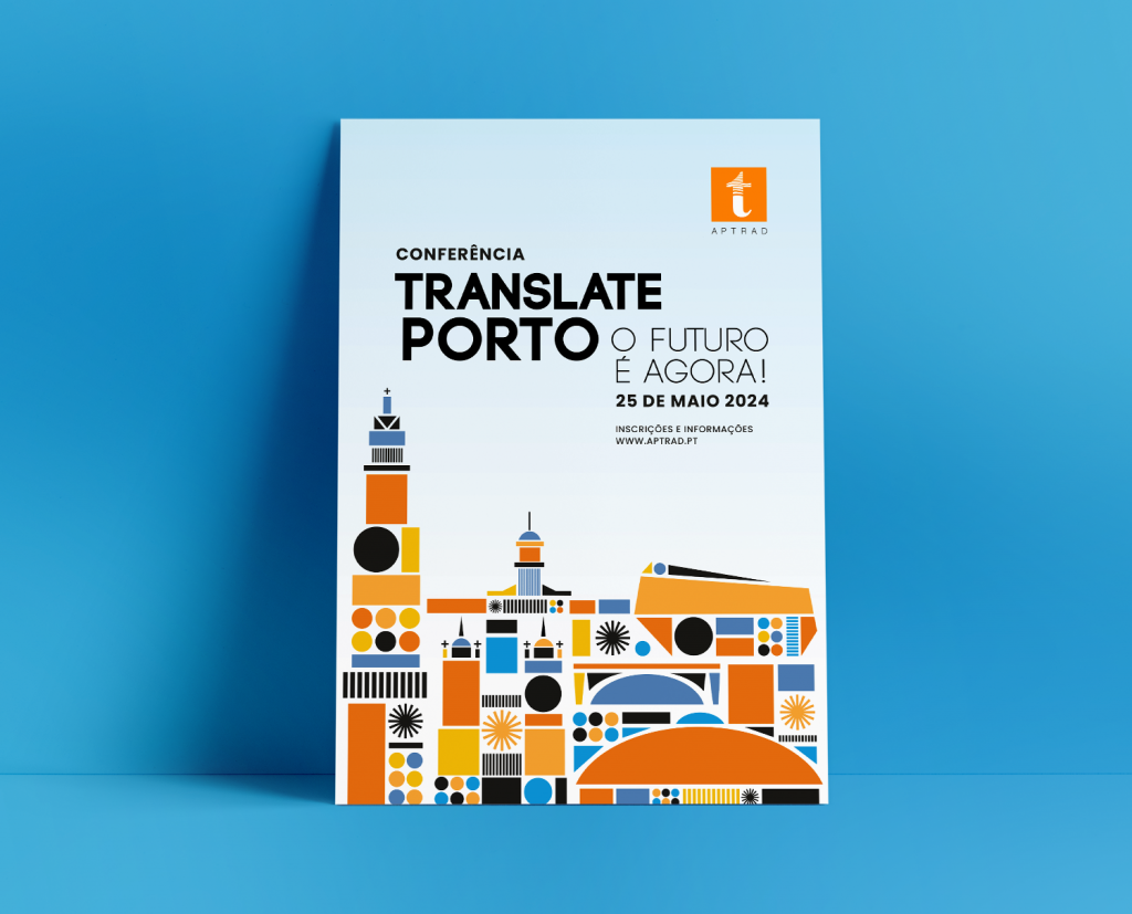
Porto: Where the Journey Begins
Our first collaboration, Translate Porto, set the tone. An illustration rooted in the city’s architecture, yet projected into the future. We drew inspiration from the golden age of computing graphics – when the pixel met poetry – to reflect Porto’s cosmopolitan and multicultural energy. Technology, culture, and connection converge in a playful composition that’s unmistakably Porto.
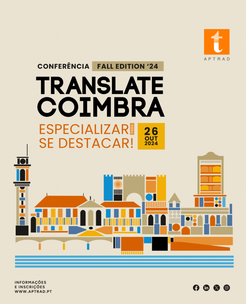
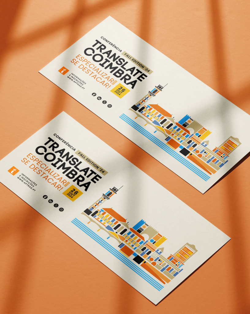
Coimbra: Academic Precision Meets Graphic Rhythm
Next came Translate Coimbra. A new theme – “Specialize to Stand Out” – and a new city to interpret. The same visual language, tuned to Coimbra’s rhythm. Academic towers and tiled facades take shape in a palette that diverges from Porto while preserving consistency. This is how coherence becomes identity: not by repeating, but by evolving.
Guimarães: The Origin of a Nation, Reimagined
With Translate Guimarães, the challenge was dual: honor the past, and embrace the now. We integrated the historical weight of Guimarães with the bold geometry of the José de Guimarães Arts Center and the ascent of the Penha Tramway – tradition and transformation, side by side. A city of origins, redesigned for the future.

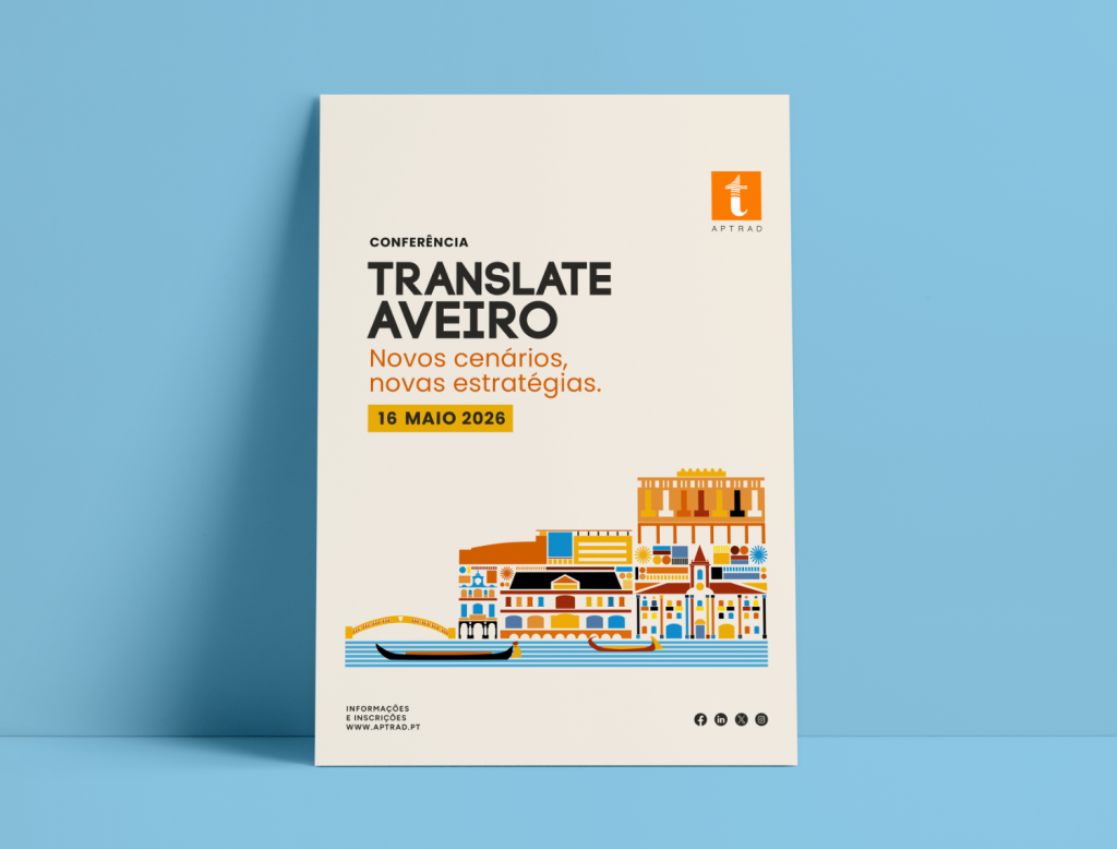
Aveiro: A Strategy in Color
Finally, Translate Aveiro. “New Scenarios, New Strategies” called for a brighter, more fluid approach. We leaned into Aveiro’s maritime identity – canals, moliceiros, university landmarks – and borrowed the warm tones of ovos moles to signal bold tradition. The result? A strategy in color and rhythm that respects the whole while celebrating the part.
A System, Not a Template
This series is more than four posters. It’s a design system in motion – flexible, memorable, and emotionally anchored in place. Each identity speaks in its own tone, yet clearly belongs to the same voice.
At Dotgraf, We don’t just illustrate cities, we translate their soul into graphic design
Looking to give your event a strong visual identity?
Let’s craft something that speaks louder than words.