The Power of Typography in Design
As designers, we understand that typography is an essential aspect of both web and graphic design. It is the foundation of visual communication, providing structure, hierarchy, and legibility. But today, designers like us are taking bold and unique typography choices to the next level in web and graphic design.


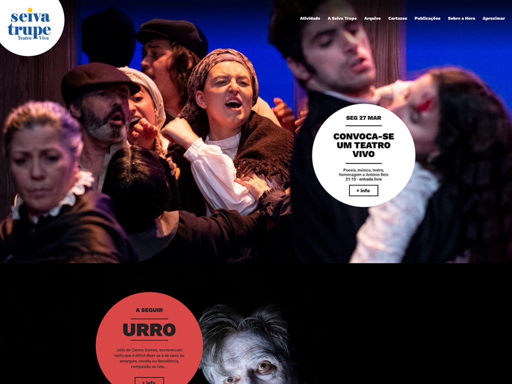
With web design continuously evolving, typography is playing an increasingly crucial role. It helps establish hierarchy, guides the user’s attention, and creates a consistent visual style for websites. By incorporating bold and unique typography choices, we have the power to infuse character, personality, and interest into a website. These design elements make a brand’s tone of voice and messaging more memorable and impactful while enhancing the overall user experience. A well-designed typography system that emphasizes readability and accessibility can increase engagement and provide a seamless and enjoyable user experience.


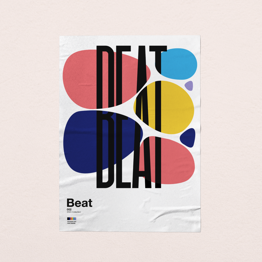
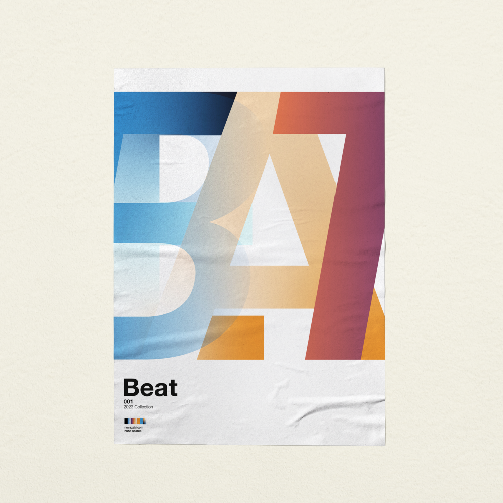
In graphic design, typography is also critical. Whether it’s a logo, poster, or packaging design, typography plays an important role in generating intrigue, delivering brand messages, and fostering engagement with the target audience. The availability of various fonts, styles, and techniques offers us numerous opportunities to communicate a brand’s personality and messaging memorably and impactfully.


As designers, we have always embraced typography as a tool for creativity and self-expression. The result is a wide range of unique and bold typography designs that reflect our individuality as well as the brand. These designs can go beyond the traditional serifs and sans-serifs, and take on a more adventurous and expressive form. We’re not afraid to experiment with color, size, and weight, and to push the boundaries of what is considered conventional in typography.
Blog post by Nuno Soares,
Partner/ Art Director


